Nur
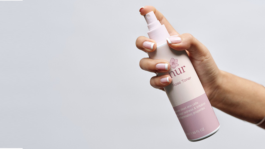
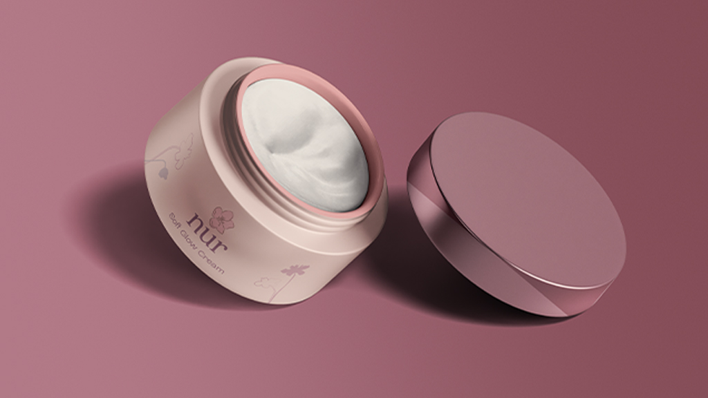
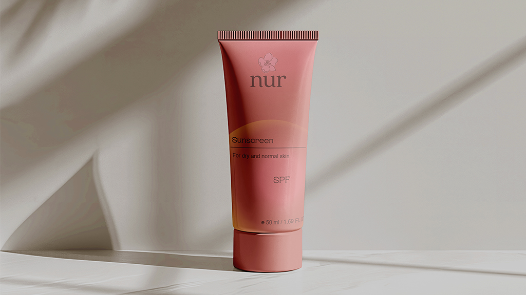
Rebranding of Nur, a brand focused on creating chemical free skincare products for pregnant women.
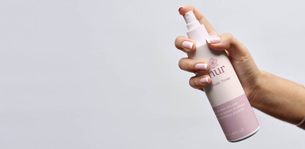
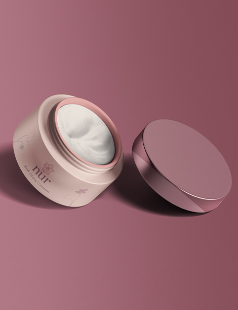
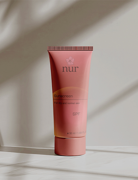
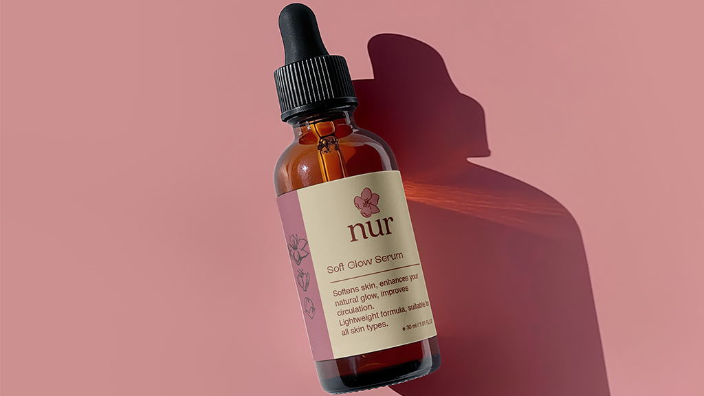
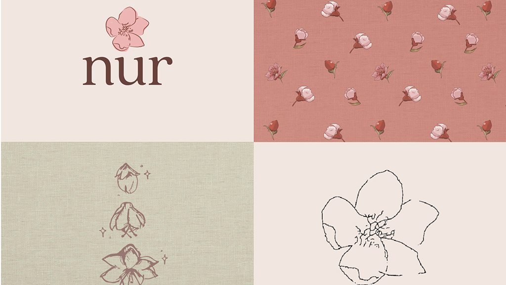
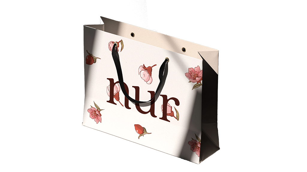
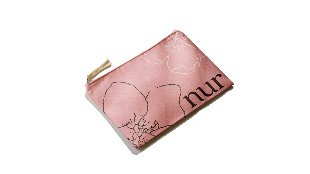
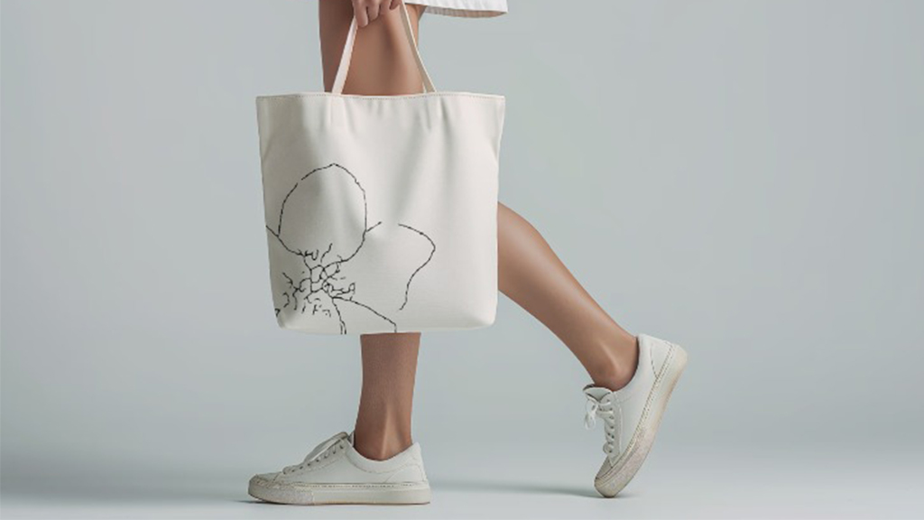
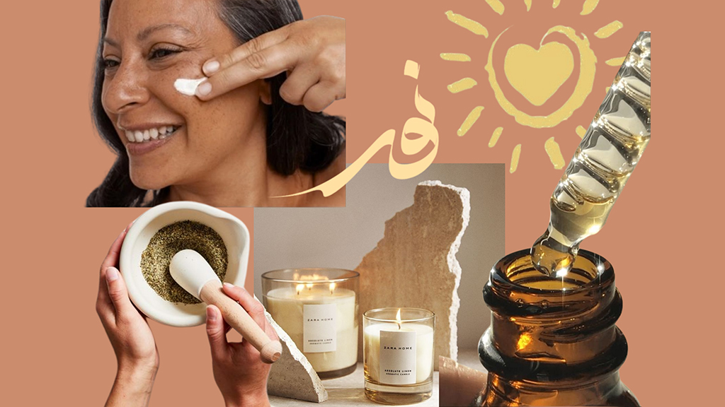
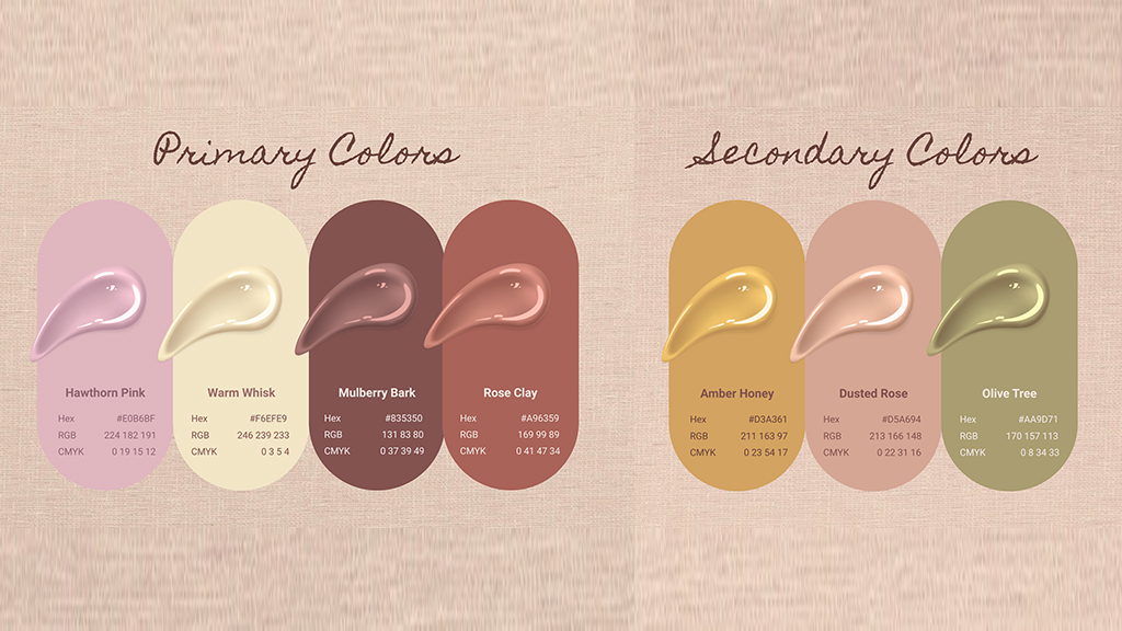
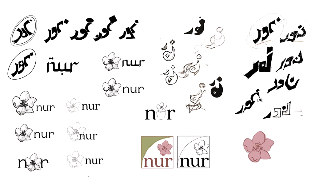
Juggun Kazim set out to create chemical-free, safe skincare for women through every life stage, inspired by her own journey and named “nur” after her daughter. Despite its heartfelt story, the brand’s visuals felt clinical and cold, with little emotional connection; the packaging lacked distinction, leaned medicinal, and relied heavily on Juggun’s popularity. In rebranding nur, we centred its true tone—warm, grounded, and reassuring, like guidance from an elder sister or trusted friend. Our research explored themes of motherhood, light, and warmth, leading us to the hawthorn flower as the core symbol. The essence of nur is nurture—growth, protection, healing, and transformation—and the hawthorn, rich in symbolism, reflects renewal, love, and gentle strength, blooming late in spring to signal the warmth of summer. To embody this spirit, we shifted from stark whites to warm hues of yellow, orange, and green with touches of pink for femininity. Research showed people prefer inviting packaging with ingredient transparency, so the new palette and visuals focus on warmth, clarity, and emotional resonance.
